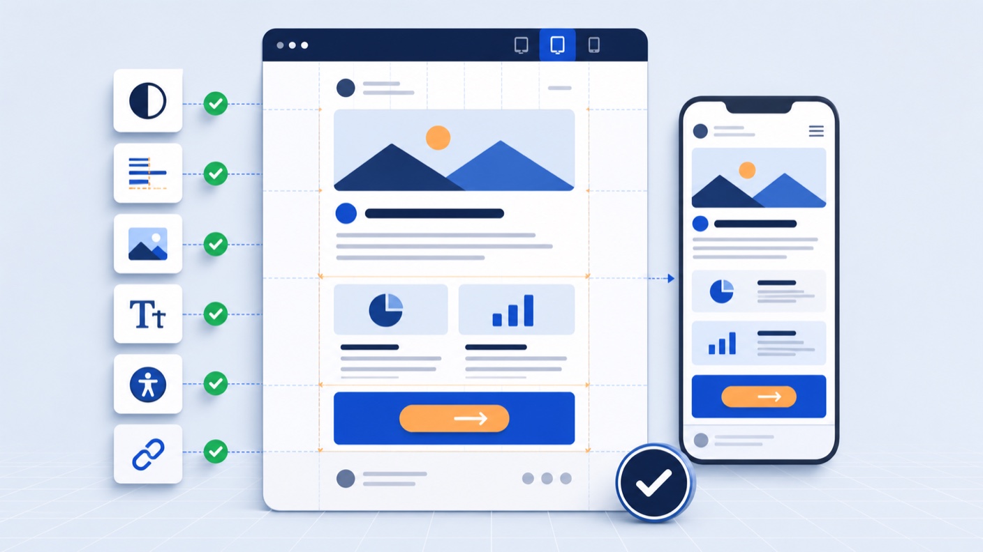
A good marketing email has to do more than look polished in a design file. It has to make sense in a crowded inbox, render across unpredictable email clients, work on a narrow screen, and survive real campaign content without the layout falling apart.
That makes email design a systems problem as much as a visual one. The strongest results come from a clear hierarchy, dependable modules, accessible content, and sensible rules about what campaign creators can change.
This guide covers the email design best practices that matter in day-to-day production, from the first content decision to the final inbox test.
1. Give the email one clear job
Before choosing a layout, decide what the reader should understand and what you want them to do next. A campaign can contain several links, but its purpose should still be easy to state in one sentence.
A product launch might need to introduce the product and send interested readers to a product page. A monthly update might need to help readers scan several stories. Those jobs call for different structures.
Write a short brief before designing:
- Audience: Who is receiving this, and what do they already know?
- Message: What is the one point they should remember?
- Action: What is the most useful next step?
- Evidence: What detail, image, or proof helps them take that step?
This keeps visual decisions tied to the campaign goal. It also makes review easier because the team can judge the design against a shared brief rather than personal taste.
2. Design the inbox impression first
The design starts before the email is opened. Sender name, subject line, and preview text determine how the message appears next to every other email in the inbox.
Treat those elements as a set:
- Use a sender name that recipients will recognise.
- Make the subject line specific enough to be useful without relying on mystery.
- Use preview text to add information rather than repeat the subject.
- Check what appears when the preview text is longer or shorter than expected.
Once the email is open, the first screen should quickly confirm the promise made in the inbox. A reader who opens an email about an event should not have to scroll past a broad brand statement to find the date and registration link.
3. Build a hierarchy for scanning
Most readers scan before they commit to reading. A strong hierarchy lets them identify the topic, supporting information, and next action in a few seconds.
A dependable opening sequence is:
- A short label or eyebrow when context is needed
- A clear headline
- Concise supporting copy
- A primary call to action
Size is only one way to create hierarchy. Spacing, contrast, alignment, and position can do just as much work. If every section uses a large headline, bright image, and bold button, nothing feels important.
Keep paragraph widths comfortable, break long sections into meaningful groups, and use headings that tell the reader what follows. “What changes in the new plan” is more helpful than “More information”.
4. Design for narrow screens from the start
A desktop comp can hide problems that become obvious on a phone. Work with a flexible, mobile-aware structure early rather than treating mobile as a reduced version at the end.
For many marketing emails, a desktop content width around 600 to 640 pixels remains a useful starting point. The exact width matters less than what happens below it. On smaller screens:
- Stack columns in a deliberate reading order.
- Keep essential text and controls away from the edges.
- Make buttons easy to tap without crowding nearby links.
- Avoid body copy that becomes tiny when a fixed layout scales down.
- Crop images intentionally instead of leaving the email client to make the choice.
- Check that navigation remains useful when space is limited.
One-column layouts are often the most reliable option, but they are not a rule for every email. A two-column product module can work well if it has a clear stacking order and each item still makes sense on its own.
5. Use live text for the message
Text baked into an image creates several problems at once. It may be unreadable when scaled, inaccessible to screen readers, hidden when images are blocked, and awkward to update for a new campaign or language.
Keep headlines, body copy, prices, dates, and calls to action as live HTML text whenever possible. Images should support the message, not carry all of it.
When an image does contain meaningful information, add alt text that communicates its purpose. Decorative images can use empty alt text so they do not create noise for people using assistive technology.
Image dimensions also need to be set in the HTML. Reserved dimensions reduce layout shifts as images load and help maintain the intended composition.
6. Make accessibility part of the template
Accessibility is easier to maintain when the template handles it by default. If every campaign creator has to remember every requirement from scratch, small problems will appear over time.
Useful template-level safeguards include:
- A logical heading order
- Sufficient colour contrast for text and important controls
- Body text that remains readable without zooming
- Links that describe their destination instead of saying “click here”
- Buttons with enough visual weight and space around them
- Alt-text fields for meaningful images
- A declared language for the document
- Sensible reading order in both desktop and stacked mobile layouts
Do not communicate meaning through colour alone. A sale price, warning, or status needs a text cue as well as a colour change.
Also review animated content. Fast or continuous movement can be distracting, and the first frame should still communicate the message if animation is unavailable.
7. Plan for dark mode rather than chasing one perfect version
Dark mode behaviour varies between inboxes. Some clients respect the colours in the email, some invert selected colours, and others make broader changes. There is no single dark-mode fix that produces identical results everywhere.
Aim for a design that remains understandable under several behaviours:
- Use logos and icons with enough separation from both light and dark backgrounds.
- Avoid transparent assets that disappear when the background changes.
- Test brand colours after inversion, especially subtle tints and muted text.
- Add a boundary around buttons when the fill could blend into the background.
- Check photography and illustrations against both light and dark surrounding colours.
Dark-mode testing is especially important for templates because one weak colour pairing can affect every future campaign built from that module.
8. Design modules around real content
The neatest version of a module is rarely the one that breaks. Problems appear when a headline wraps to four lines, a product name is unusually long, an image is missing, or translated copy needs more space.
Stress-test each module with realistic extremes:
- The longest likely headline
- Short and long body copy
- A missing optional image or eyebrow
- Multiple calls to action
- Different image crops and aspect ratios
- Prices with discounts or qualifiers
- Localised copy that expands
Decide which fields are optional and define what happens when they are empty. An optional subtitle should disappear cleanly, without leaving a blank band of spacing behind it.
This is one reason modular email templates are useful. A module can be designed, tested, and documented as a reusable unit instead of being improvised in every campaign.
9. Turn recurring decisions into a design system
If the same choices appear in every email, capture them once. An email design system gives designers, developers, and marketers a common set of rules for producing campaigns.
At minimum, document:
- Type styles and fallback fonts
- Brand and functional colours
- Spacing values
- Button styles and states
- Image ratios and cropping guidance
- Approved modules and their intended uses
- Mobile stacking behaviour
- Accessibility requirements
- Content limits where they protect the layout
The module library is the working part of the system. Include enough variation to cover the email programme without creating several versions of the same block. A hero, feature row, product grid, text section, divider, quote, and footer will cover many teams’ core needs when each has thoughtful options.
Review the library against campaigns the team actually sends. A theoretically complete system is less useful than a smaller library that reflects real production work.
10. Protect structure while keeping content flexible
Most broken campaigns are not caused by a lack of design freedom. They happen because a routine content change exposes layout controls that the editor should not need to touch.
Define the editable parts of each module clearly. A campaign creator may need to change the headline, copy, image, link, alignment, or background option. They probably do not need access to table structure, responsive CSS, or arbitrary spacing values.
This is the practical value of a CMS for email: content fields, not code. The developer protects the HTML and rendering behaviour while the marketing team works with the content that changes from campaign to campaign.
Useful constraints can still allow meaningful choice. For example, a module might offer two approved image positions, three brand background colours, and an optional secondary link. That is enough flexibility for varied campaigns without turning each send into a new design exercise.
11. Test the system and the campaign separately
There are two levels of email quality assurance, and they catch different problems.
Template and module testing checks the underlying system. It covers supported email clients, responsive behaviour, dark mode, accessibility patterns, fallbacks, and common content variations. This work should happen before a module becomes available to campaign creators.
Campaign testing checks the specific send. It covers copy, links, personalisation, tracking parameters, subject and preview text, image choices, dynamic content, and the final audience or suppression rules.
Before sending, test in the email clients that matter to your audience rather than choosing a matrix based on habit. Include at least the main desktop, webmail, and mobile environments shown in your subscriber data.
Send a real test message as well as using a preview. Check it with images enabled and disabled, open the links, and read it on a phone. The small friction points are much easier to notice in an inbox than in a design canvas.
12. Keep the HTML lean and portable
Email code needs fallbacks and client-specific techniques, but it can still be organised and maintainable. Remove unused styles, compress images, avoid unnecessary nesting, and keep the content separate from structural markup where your workflow allows it.
Portable HTML also reduces the cost of changing sending platforms. An ESP-agnostic email editor keeps the design and production workflow independent from the tool used for delivery.
If a design starts in Figma, involve someone who understands email rendering before every detail is approved. Web patterns do not always translate directly to inboxes. Our guide to turning Figma designs into production-ready HTML email explains where specialist implementation helps.
A practical pre-send checklist
Use this list after the content is final and before scheduling the campaign.
Message and hierarchy
- The subject, preview text, and opening content tell one consistent story.
- The primary action is clear without reading every word.
- Headings describe the content below them.
- Important information appears early enough for the campaign type.
Responsive design
- Columns stack in the intended order.
- Text remains readable on a narrow screen.
- Buttons and links have enough space for touch.
- Images crop cleanly and do not force horizontal scrolling.
Accessibility
- Meaningful images have useful alt text.
- Decorative images use empty alt text.
- Text and controls have sufficient contrast.
- Link copy makes sense out of context.
- The reading order remains logical when modules stack.
Content and functionality
- Every link opens the correct destination.
- Personalisation has a safe fallback.
- Dates, prices, offer terms, and tracking parameters are correct.
- Dynamic content has been checked for each important variation.
- The plain-text version is readable.
Inbox testing
- The campaign has been sent to real test inboxes.
- It has been checked with images blocked.
- Light and dark modes have both been reviewed.
- The main client and device combinations for the audience have been covered.
Measure whether the design is helping
Open and click rates can point to a problem, but they do not explain it on their own. Look at the action the email was designed to support and compare campaigns with similar audiences and goals.
Useful signals include click distribution, conversion rate, unsubscribe rate, spam complaints, reading time where available, and the performance of individual modules over several sends. If readers repeatedly ignore a secondary section, the answer may be a clearer heading, a different position, or removing the section entirely.
Production data matters too. Track how long campaigns take to build, how often developers are pulled into content changes, and how many QA issues recur. Better email design should improve the reader’s experience and make the team’s work more dependable.
Good email design should hold up under pressure
The real test of an email design is not the first approved comp. It is the tenth campaign assembled by a busy marketer, viewed on a small screen in an awkward email client.
Clear hierarchy, responsive modules, accessible defaults, protected structure, and focused testing make that outcome much more predictable. Once those foundations are part of the system, the team can spend more time on the message and less time repairing the template.
If your current workflow still relies on copying old campaigns or editing HTML for routine changes, see how Modular Mail works or book a demo.