A practical guide to building an email design system that keeps your campaigns consistent, your team fast, and your developers sane.
If your team sends more than a few email campaigns a month, you’ve probably felt the slow creep of inconsistency. Colours drift. Button styles vary. Spacing changes depending on who built the email. Someone finds an old template in a Google Doc and uses that instead of the current one.
An email design system solves this. Not by adding more rules for people to ignore, but by baking those rules into the building blocks themselves.
This guide covers what an email design system actually is, what it includes, how it differs from just having a collection of templates, and how to build one from scratch. Whether your team is three people or thirty.
What is an email design system?
An email design system is a documented set of standards, reusable components, and guidelines that govern how your organisation designs, builds, and produces email campaigns.
If you’ve worked with design systems in web or product design (tools like Figma component libraries or something like Google’s Material Design) the concept is similar. But email has its own constraints. Limited CSS support, inconsistent rendering across clients, table-based layouts, and the reality that your emails need to look right in everything from Apple Mail to Outlook 2016. An email design system accounts for all of this.
At its simplest, an email design system includes three things:
- Design tokens: the foundational values (colours, fonts, spacing) that define your brand in email
- Modules: reusable, pre-built content blocks that snap together to form complete emails
- Guidelines: the rules for how everything gets used, by whom, and when
The goal is to make it easy for anyone on your team to produce a professional, on-brand email without needing to understand HTML, without waiting for a developer, and without accidentally breaking something.
How is an email design system different from having email templates?
This distinction matters, because most teams think they have a design system when what they really have is a folder of templates.
Templates are finished emails. They’re complete layouts designed for a specific purpose: a newsletter template, a promotional template, a transactional template. To create a new campaign, you duplicate a template and change the content. The problem is that templates are rigid. They work for the exact use case they were designed for, but the moment you need something slightly different (a campaign with three product blocks instead of two, or a hero image with text overlay instead of a plain banner) you’re either hacking the template or asking a developer for help.
A design system is the system behind the templates. Instead of complete layouts, you have individual components (modules) that can be assembled in different combinations. Instead of duplicating a finished email and swapping content, you’re selecting modules from a library and stacking them to build something new. The structure of each module is locked. The content is flexible. And because every module follows the same design tokens, anything you build looks cohesive.
Think of it this way: templates are like buying a pre-built piece of furniture. A design system is like having a set of components that fit together in multiple configurations, all built from the same materials and finished to the same standard.
The practical difference is significant. Teams using templates typically maintain 10-20 complete email layouts and work within their constraints. Teams using a design system maintain a library of 15-30 modules and can produce hundreds of distinct email layouts without any development work.
What’s inside an email design system?
Let’s break down each layer.
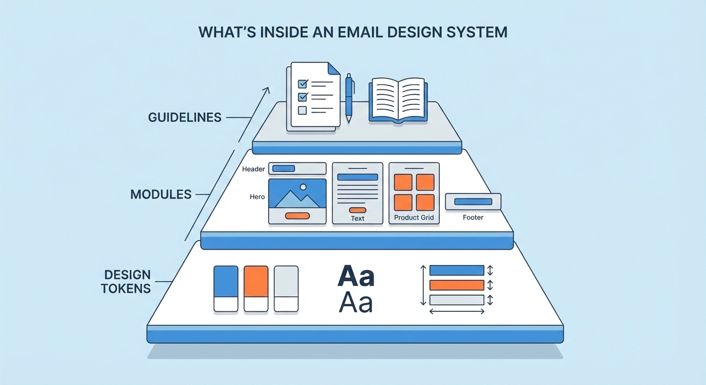
Design tokens
Design tokens are the smallest decisions in your system. They’re the raw values that define your brand’s visual identity in email, and they get referenced by every module you build.
Colour palette. Your primary, secondary, and accent colours, plus their specific hex values. In email, you also need to think about dark mode. How will your colours adapt? Which backgrounds should invert and which shouldn’t? Document both the light-mode values and any dark-mode overrides.
Typography. Your primary and fallback font stack. Email font support is limited compared to the web, so you’ll likely need a web-safe fallback for clients that don’t support web fonts (Outlook, for example, ignores most web fonts entirely). Specify your heading sizes, body copy size, line heights, and font weights. A typical email might use:
| Level | Size | Weight | Use |
|---|---|---|---|
| H1 | 28-32px | Bold | Hero headlines |
| H2 | 22-24px | Bold | Section headings |
| Body | 14-16px | Regular | Paragraph text |
| Small | 12-13px | Regular | Captions, legal text, footer content |
Spacing. Consistent padding and margins between elements. Define your base spacing unit (commonly 8px or 10px) and build everything from multiples of that unit. Module internal padding, gaps between modules, content margins: document all of it. When spacing is consistent, your emails feel polished even when the content changes dramatically between campaigns.
Button styles. CTA buttons are critical in email. Define the shape (rounded, square, pill), padding, font size, colours (primary, secondary, ghost/outline), and the bulletproof HTML/CSS method you’ll use to make them render in Outlook. Most email teams use a combination of padding-based buttons and VML fallbacks for Outlook. Decide on your approach once and bake it into every button module.
Image guidelines. Maximum widths, aspect ratios for hero images and thumbnails, file format preferences (JPEG for photos, PNG for graphics with transparency), and file size limits. You might also specify alt text requirements and how images should behave on retina displays (2x images scaled down via HTML attributes, for instance).
Border and divider styles. If you use horizontal rules, card borders, or section dividers, specify their colour, thickness, and spacing.
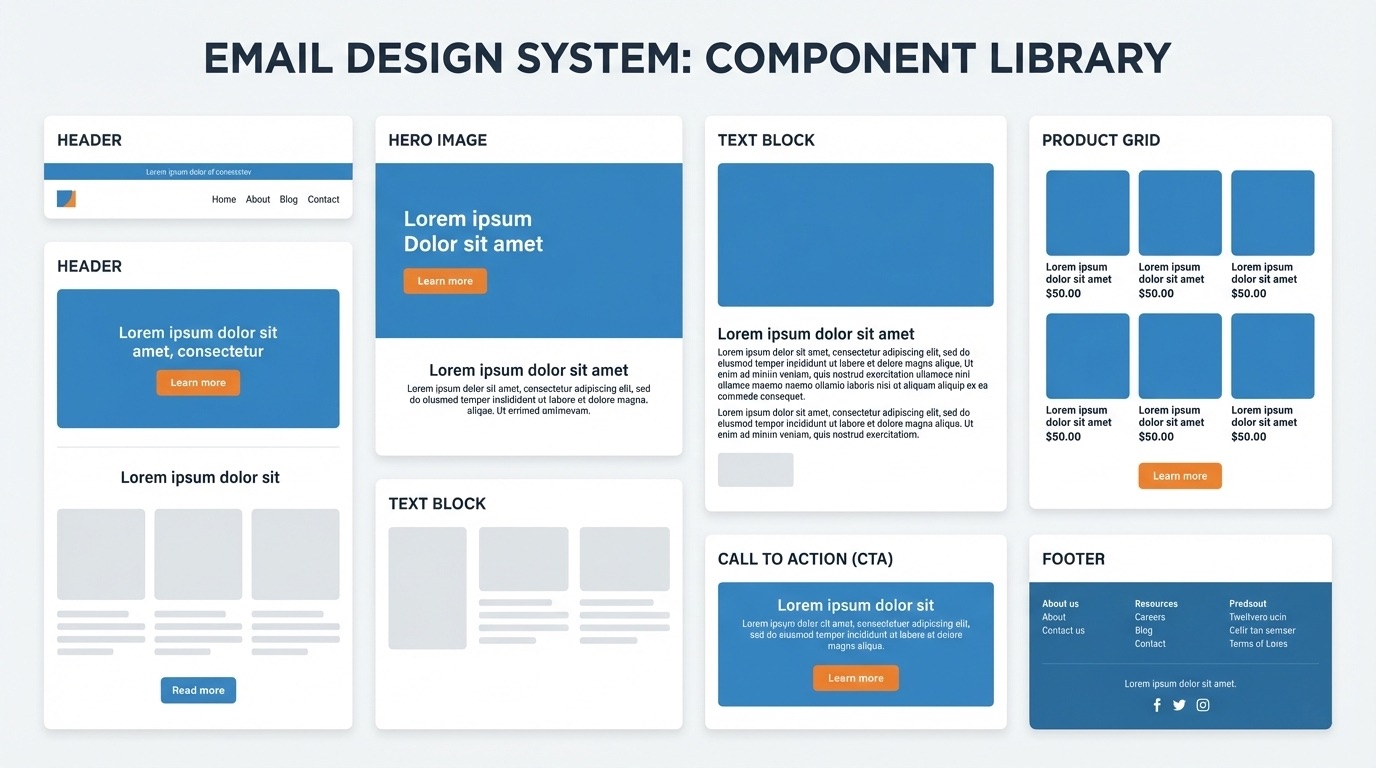
Modules
Modules are the heart of the system. Each module is a self-contained content block with a defined purpose, locked structure, and editable content areas.
A solid email design system typically includes these module categories:
Structural modules, used in every email:
- Header: Logo, optional navigation links, preheader connection. Locked across all campaigns so every email starts the same way.
- Footer: Unsubscribe link, legal text, social links, physical address (CAN-SPAM/GDPR requirement). Also locked for compliance.
Content modules, mixed and matched per campaign:
- Hero: Large banner image or image-with-text-overlay. Usually the first content module below the header. Often has a headline, subheading, and CTA.
- Text block: Simple heading and paragraph copy. The workhorse of most emails.
- Image + text: Side-by-side layout (image left/text right, or vice versa) that stacks on mobile. Useful for product features, article teasers, or storytelling.
- Product card / grid: One, two, or three-column layouts for showcasing products or content items with images, titles, prices, and CTAs.
- CTA block: Standalone call-to-action, often used as a section divider or emphasis block. Centred button with optional supporting text.
- Social proof: Testimonial quotes, star ratings, or review snippets.
- Countdown / urgency: Deadline text, offer expiry, or time-limited messaging.
Utility modules:
- Spacer: Controlled vertical space between sections. Better than adding arbitrary padding to content modules.
- Divider: A horizontal rule or visual separator with consistent styling.
- Banner / announcement bar: Thin strip for global messaging (free shipping, sale notice, etc.).
Not every team needs every module type. Start with the ones you use most frequently and add new ones as your campaigns require them. A good starting set for most teams is: header, footer, hero, text block, image + text, product card (1-column and 2-column), CTA block, and spacer. That covers probably 80% of campaigns.
Guidelines and documentation
This is the part most teams skip, and it’s the part that determines whether your design system actually gets used.
Module usage guidelines. When should someone use a hero vs. an image + text block? What’s the maximum number of product cards before the email gets too long? Are there modules that should always appear together (for example, a CTA block after every product section)? Write short, practical rules. Not an essay, just enough guidance to prevent bad decisions.
Content guidelines. Character limits for headlines and body copy within each module. Image dimension requirements. CTA copy conventions (do you use “Shop now” or “Shop Now”? “Learn more” or “Find out more”?). If your brand has restricted terms or required legal language, document those here too.
Assembly rules. Some modules might need to appear in a specific order. Maybe your hero always comes first. Maybe the footer is always preceded by a specific CTA block. Maybe you never stack two text-heavy modules in a row without a visual break. These rules prevent emails from feeling structurally awkward.
Accessibility standards. Alt text requirements for every image. Minimum contrast ratios for text on coloured backgrounds. Semantic heading hierarchy (don’t jump from H1 to H3). Link text that makes sense out of context (“Read the full case study” instead of “Click here”). These aren’t optional: they affect deliverability and legal compliance, not just usability.
How to build an email design system from scratch
If you’re starting from zero, here’s a practical, step-by-step approach.
Step 1: Audit what you already have
Before designing anything new, look at what your team is currently sending. Pull the last 20-30 campaigns and look for patterns.
Which layouts appear most often? Which sections get reused across different email types? Where do things look inconsistent, and why? Are there campaigns that performed well that could inform your module designs?
You’re not looking for perfection in this audit. You’re looking for the 6-10 recurring content blocks that, if standardised, would cover most of your email production.
Also note the pain points. Where do things break? Which templates are people afraid to touch? What requires developer involvement that shouldn’t? These problems will inform your design system priorities.
Step 2: Define your design tokens
Take your brand guidelines and translate them into email-specific values. If you don’t have formal brand guidelines, use your website as the reference point: pull the colours, fonts, and spacing from there and adapt for email constraints.
The key word is adapt. Your website might use Inter or a custom typeface that doesn’t render in email clients. You’ll need a fallback stack. Your website might use 16px body copy, but 14px often reads better in email because the viewport is narrower. Your web colour palette might include shades that don’t meet contrast requirements on mobile screens.
Document these values in a simple, shareable format. A single-page reference sheet is more useful than a 40-page PDF that nobody reads.
Step 3: Design your core modules
Work with your designer (or design the modules yourself if you’re a smaller team) to create visual designs for each module type. Figma is the standard tool here, but Sketch or even a well-structured Google Doc can work.
Design each module in both desktop and mobile views. Email modules typically stack vertically on mobile, so a two-column product grid becomes a single-column stack. Make sure your designs account for this.
Keep modules focused. Each one should do one thing well. If a module tries to handle too many variations, it becomes complex to build and confusing to use. It’s better to have a “hero with image background” and a “hero with plain background” as separate modules than one hero module with 15 configuration options.
Step 4: Build the HTML
This is where design becomes functional. Each module needs to be coded as clean, tested HTML that renders correctly across email clients.
Email HTML is its own discipline. If you have an email developer on your team, they’ll handle this. If not, this is typically where an agency or specialist comes in. The code needs to be:
- Table-based for layout (CSS Grid and Flexbox aren’t reliable across email clients)
- Inline-styled for maximum compatibility (though some clients support
<style>blocks) - Tested across major clients: Apple Mail, Gmail (web and mobile), Outlook (2016, 2019, 365), Yahoo, and Samsung Mail at minimum
- Responsive, usually via media queries or a fluid/hybrid approach
The HTML for each module should be self-contained: it shouldn’t rely on styles defined elsewhere in the email. This is what makes modules truly reusable. You can drop any module into any position and it looks correct.
Step 5: Assemble and test a master template
Before distributing your modules to the team, build a master template that includes every module stacked together. This lets you test how modules interact with each other: spacing between them, how colours and typography flow across sections, how the email looks as a complete composition.
Send test emails using a tool like Litmus or Email on Acid to check rendering across clients. Fix any issues at the module level, not the template level, so the fixes carry across all future campaigns.
Step 6: Make it usable for your team
This is the step that separates a design system from a developer’s side project.
Your modules are coded and tested. Now your marketing team needs a way to actually use them without touching HTML. There are several approaches:
The manual approach: Store your modules as HTML snippets in a shared drive or documentation site. Your team copies and pastes modules into their ESP’s code editor, swaps content, and sends. This works for very small teams but breaks down quickly. It’s error-prone, version control is difficult, and non-technical people will eventually break something.
The ESP-native approach: Some email platforms (like Salesforce Marketing Cloud or Marketo) support modular templates natively. You upload a master template with defined editable regions, and your team edits content within those regions. The limitation is that you’re locked to one platform, and each ESP handles modules differently. Your design system becomes platform-specific.
The email CMS approach: Tools like Modular Mail sit between your design system and your ESP. Your developer uploads the HTML template and defines which parts are editable. Your marketing team gets a visual editor with content fields (text, images, links, CTAs) but can’t touch the structure or styling. When the campaign is ready, they export clean HTML and upload it to whatever ESP they use. This approach requires initial developer setup to define the template structure, but once that’s done, the design system stays intact regardless of who builds the campaign or where it gets sent.
The right approach depends on your team size, technical resources, and how many campaigns you produce. But the principle is the same: your design system should be the guardrails, not the obstacle.
Step 7: Maintain and evolve
A design system isn’t a one-time project. It’s a living thing that evolves with your brand and your campaigns.
Set a cadence for reviewing your modules. Quarterly works for most teams. Are there modules nobody uses? Remove them. Are there campaign types that require layouts your current modules don’t support? Design new ones. Has your brand updated its colour palette or typography? Update your design tokens and cascade the changes through your modules.
The best design systems grow gradually. Start small, get your team comfortable with the workflow, and add complexity only when you need it.
Common mistakes to avoid
Over-engineering from the start. You don’t need 40 modules on day one. Start with 8-10 that cover your most common campaigns. You can always add more.
Designing for desktop only. More than half of emails are opened on mobile. If your modules aren’t designed and tested for mobile from the beginning, you’re building on a shaky foundation.
Forgetting about dark mode. Dark mode support varies wildly across email clients. Some invert your background colours, some don’t, and some only partially transform your styles. Test your modules in dark mode and make deliberate decisions about which elements should adapt.
Making modules too flexible. A module with 20 configuration options is harder to use than three simple modules. Constraint is a feature, not a limitation. The whole point is to make it easy to build consistent emails.
Not documenting anything. If the design system knowledge lives in one person’s head, it’s not a system. It’s a dependency. Even minimal documentation (a one-page reference sheet with your tokens, a screenshot library of your modules, and a few assembly guidelines) makes a huge difference.
Skipping the accessibility basics. Alt text on every image. Sufficient colour contrast. Meaningful link text. Logical heading hierarchy. These aren’t nice-to-haves: they affect deliverability, legal compliance, and a significant portion of your audience.
Who needs an email design system?
Not every team does. If you’re sending one or two campaigns a month and a single person handles everything, a well-maintained template is probably fine.
An email design system starts to pay off when:
- Multiple people build email campaigns. The more people involved, the more likely things drift off-brand without structural guardrails.
- You send frequently. Weekly or daily campaigns amplify any inconsistency. A design system turns high-volume production from painful to routine.
- You’re managing multiple brands or markets. Agencies with multiple clients, or companies with regional teams, need a way to maintain distinct brand identities without rebuilding everything from scratch.
- Your developers are bottlenecked. If every campaign requires developer involvement for layout changes, a modular system frees them up for higher-value work.
- You’re planning to switch ESPs. If your templates are built inside your ESP’s proprietary builder, they don’t migrate. An email design system built on portable HTML survives any platform change.
Getting started
If this feels like a lot, remember: the best design systems start small and grow.
Pick your 5 most-sent campaign types. Identify the modules they’d need. Define your core design tokens. Build and test those modules. Give your team a way to use them without touching code.
That’s your email design system. Everything else is iteration.
If you want to see what a module-based workflow looks like in practice, try the Modular Mail demo editor and build a campaign from reusable modules.